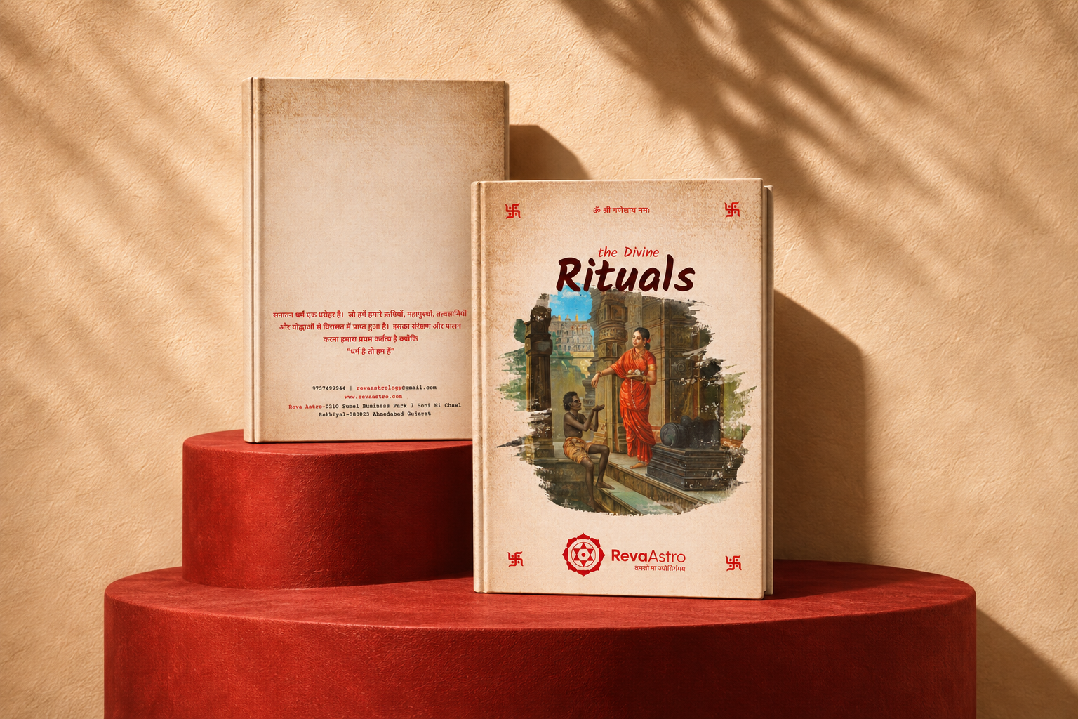
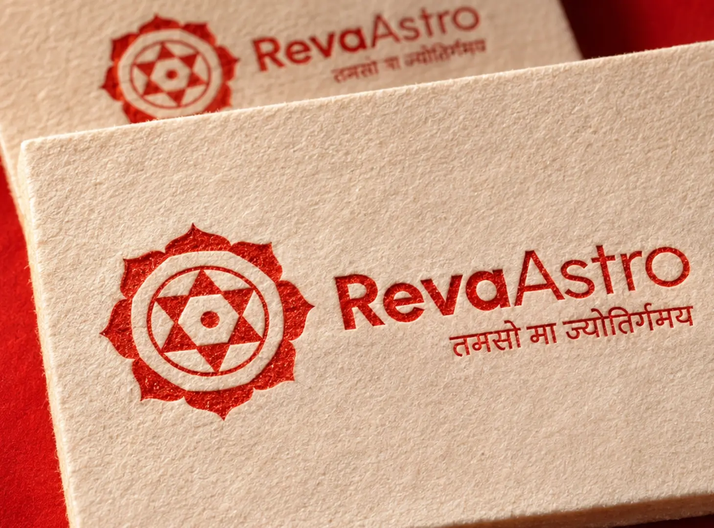
Astrobranding and visual identity. We developed a visual language for Reva Astro that connects its astrological practice with a distinctive symbol and wordmark. The construction brings geometric guides and layered forms together before resolving into the finished identity.
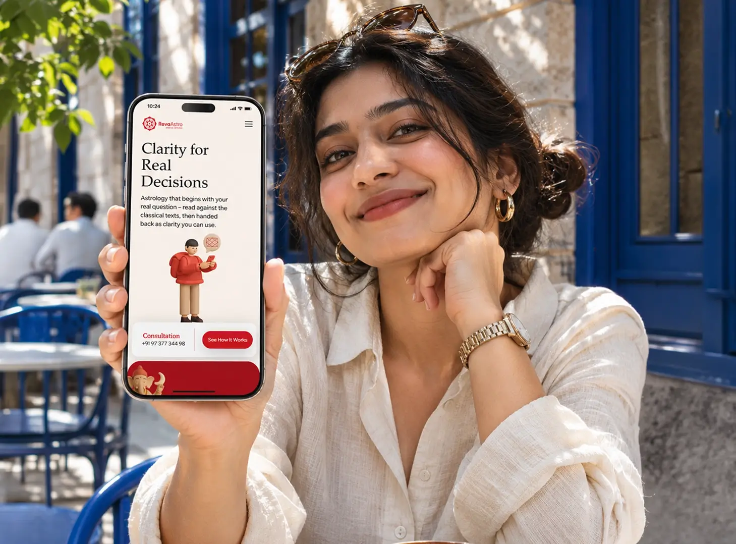
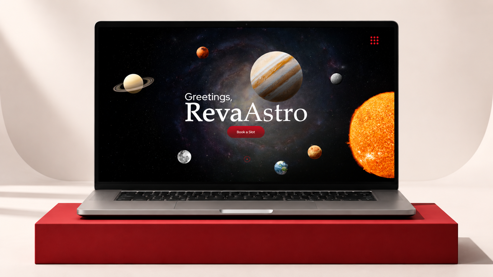
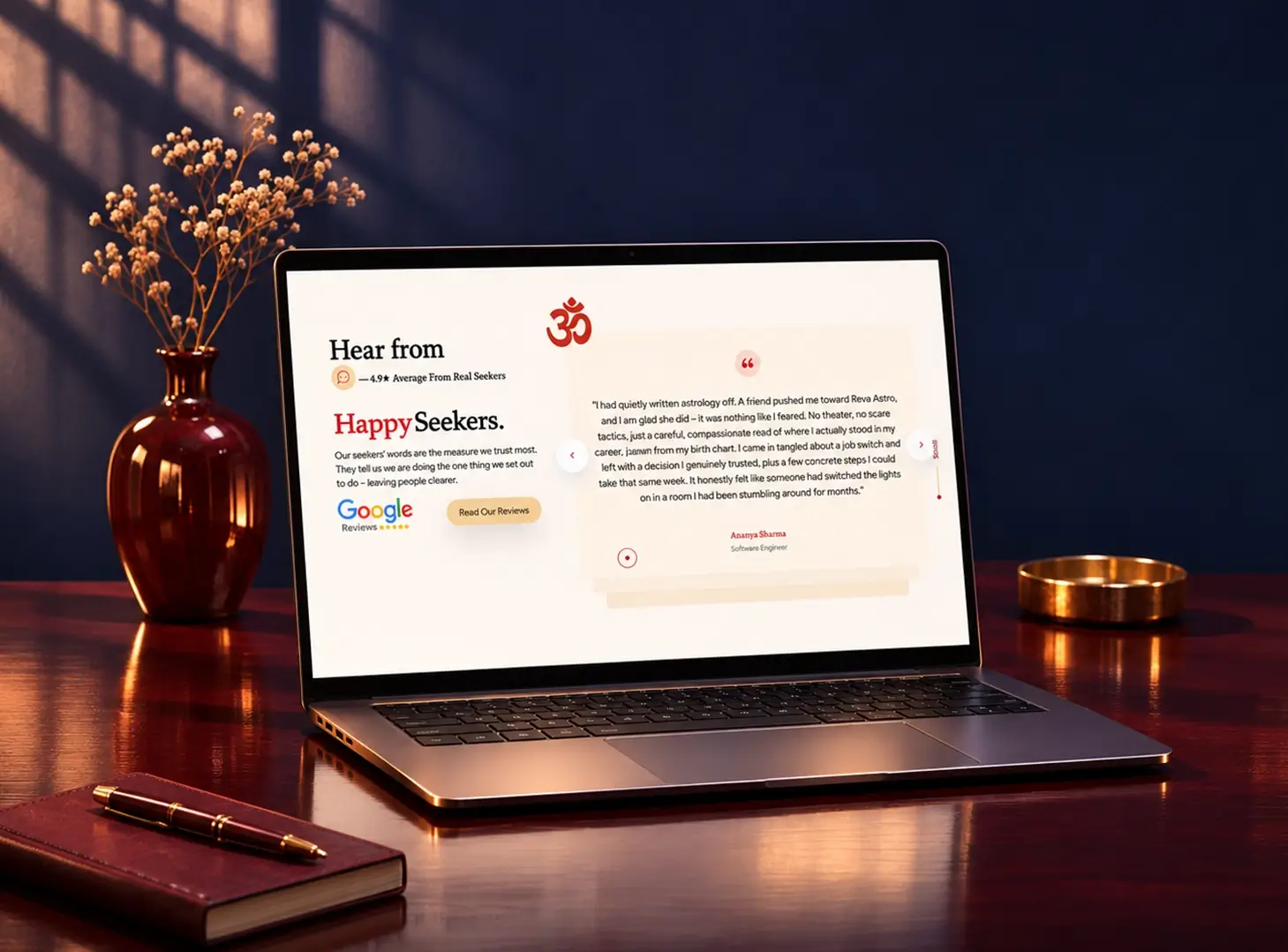
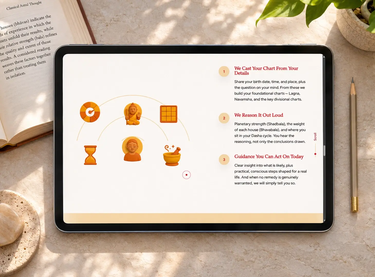
A clearer digital experience. We designed and developed the website to introduce Reva’s approach, explain its consultation process and make its range of readings easier to explore. The experience connects the brand’s visual identity with practical information and a direct route to booking.
Communication with purpose. The site presents Reva’s approach in plain language: grounded in classical texts, focused on the visitor’s questions and intended to make each consultation easier to understand.